Adding orthogonal regression line in ggplot
I have plotted a scatter graph in R, comparing expected to observed values,using the following script:
library(ggplot2)
library(dplyr)


r<-read_csv("Uni/MSci/Project/DATA/new data sheets/comparisons/for comarison
graphs/R Regression/GAcAs.csv")
x<-r[1]
y<-r[2]

ggplot()+geom_point(aes(x=x,y=y))+
scale_size_area() +
xlab("Expected") +
ylab("Observed") +
ggtitle("G - As x Ac")+ xlim(0, 40)+ylim(0, 40)
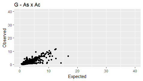
My plot is as follows:
I then want to add an orthogonal regression line (as there could be errors in both the expected and observed values). I have calculated the beta value using the following:
v <- prcomp(cbind(x,y))$rotation
beta <- v[2,1]/v[1,1]
Is there a way to add an orthogonal regression line to my plot?
Solution
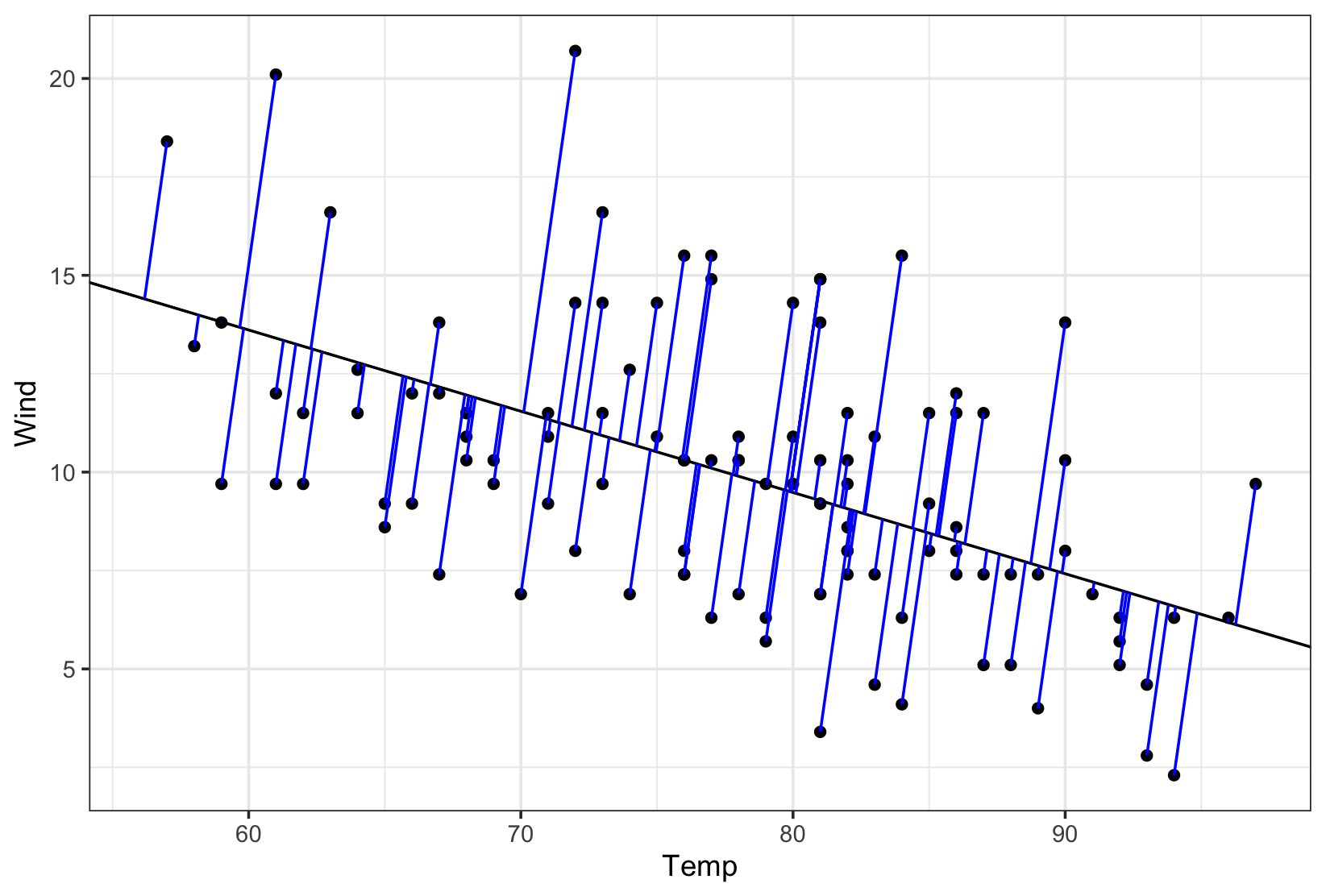
Borrowed from this blog post & this answer. Basically, you will need Deming function from MethComp or prcomp from stats packages together with a custom function perp.segment.coord. Below is an example taken from above mentioned blog post.
library(ggplot2)
library(MethComp)

data(airquality)
airquality <- na.exclude(airquality)

# Orthogonal, total least squares or Deming regression
deming <- Deming(y=airquality$Wind, x=airquality$Temp)[1:2]
deming
#>  Intercept      Slope
#> 24.8083259 -0.1906826

# Check with prcomp {stats}
r <- prcomp( ~ airquality$Temp + airquality$Wind )
slope <- r$rotation[2,1] / r$rotation[1,1]
slope
#> [1] -0.1906826

intercept <- r$center[2] - slope*r$center[1]
intercept
#> airquality$Wind
#>        24.80833

# https://stackoverflow.com/a/30399576/786542
perp.segment.coord <- function(x0, y0, ortho){
  # finds endpoint for a perpendicular segment from the point (x0,y0) to the line
  # defined by ortho as y = a + b*x
  a <- ortho[1]  # intercept
  b <- ortho[2]  # slope
  x1 <- (x0 + b*y0 - a*b)/(1 + b^2)
  y1 <- a + b*x1
  list(x0=x0, y0=y0, x1=x1, y1=y1)
}

perp.segment <- perp.segment.coord(airquality$Temp, airquality$Wind, deming)
perp.segment <- as.data.frame(perp.segment)

# plot
plot.y <- ggplot(data = airquality, aes(x = Temp, y = Wind)) +
  geom_point() +
  geom_abline(intercept = deming[1],
              slope = deming[2]) +
  geom_segment(data = perp.segment,
               aes(x = x0, y = y0, xend = x1, yend = y1),
               colour = "blue") +
  theme_bw()
Created on 2018-03-19 by the reprex package (v0.2.0).
- How to find correct projection of the shapefile data for leaflet map in r?
- How to use regex in R to shorten strings by one space
- R CRAN Check fail when using parallel functions
- Replacing several rows of data in a column efficiently using condition in a pipeline
- Iterate over vectors from an imported dataframe row-wise
- Split the legend into three rows with headings for a nested facet_wrap
- Why replace works with a boolean mask?
- Not able properly rasterize polygon dataset using terra::rasterize()
- Less than symbol ("<") in cloze schoice in Canvas (html select dropdown) shows as &lt;
- R/exams docx output does not include images
- How to have primitive discard additional arguments
- Functions Causing Objects to Disappear
- How to repel texts equidistantly on a secondary y-axis of a facet_grid?
- How can I add some text to a ggplot2 graph in R outside the plot area?
- Extracting Exact p-values from the "did" Package Output in R
- How can I set column types of several columns in empty R data frame?
- Adjust vertical line based on maximum value in graph plotly
- Combining Two Dataframes Based on Multiple Conditions & Removing Rows that Don't Match
- independent sample t-test in R using test statistics (mean, std. dev, count)
- How do I load a package without installing it in R?
- survcheck: 'x' must be an array of at least two dimensions
- Insert variable names and their specific values between the last column of facets and the strips of a facet_grid in R
- Use a recorded plot for officer
- Errors when using RStudio's Git tools
- Orientation of an irregular window changes the distance r over which secondary summary statistics are estimated
- Elegant way to check for missing packages and install them?
- How to create tmap labels along lines with rotated crs?
- How to access the value of a reactive output inside the browser console with jQuery?
- Convert excel column names to numbers
- How to adjust a node width in a Sankey plot in R?

