How to adjust the size of a Japanese candlestick chart made with MatPlotLibFinance so that all moving averages get properly-displayed on Python3?
Introduction
I recently learned how to plot Simple Moving Averages (abbreviated "SMA") using the MatPlotLibFinance library on Python3. Simple Moving Averages are trend lines that They help the investor in determining the best times to enter to buy or sell an asset.
Data
The following variables contain the data used in the Script to plot the price action, the first variable was named df_trading_pair and contains the following information:
| Index | Start Date | Open Price | High Price | Low Price | Close Price | Volume | End Date | Abs((CP-OP)/CP)*100 | Low SMA 9 | Close SMA 25 | High SMA 99 |
|---|---|---|---|---|---|---|---|---|---|---|---|
| 0 | 2022-10-23 23:42:00 | 29.24 | 29.28 | 29.24 | 29.25 | 2145.0 | 2022-10-23 23:44:59.999 | 0.03 | 29.195555555555554 | 29.236400000000003 | 28.95191919191919 |
| 1 | 2022-10-23 23:45:00 | 29.25 | 29.27 | 29.24 | 29.24 | 2233.0 | 2022-10-23 23:47:59.999 | 0.03 | 29.192222222222224 | 29.239199999999997 | 28.95848484848485 |
| 2 | 2022-10-23 23:48:00 | 29.24 | 29.24 | 29.23 | 29.23 | 1399.0 | 2022-10-23 23:50:59.999 | 0.03 | 29.193333333333335 | 29.2316 | 28.96454545454545 |
| 3 | 2022-10-23 23:51:00 | 29.23 | 29.24 | 29.21 | 29.21 | 2603.0 | 2022-10-23 23:53:59.999 | 0.07 | 29.19888888888889 | 29.2284 | 28.97060606060606 |
| 4 | 2022-10-23 23:54:00 | 29.22 | 29.3 | 29.22 | 29.25 | 5576.0 | 2022-10-23 23:56:59.999 | 0.1 | 29.209999999999997 | 29.228 | 28.977575757575757 |
| 5 | 2022-10-23 23:57:00 | 29.24 | 29.28 | 29.23 | 29.26 | 3848.0 | 2022-10-23 23:59:59.999 | 0.07 | 29.221111111111114 | 29.226799999999997 | 28.983636363636364 |
| 6 | 2022-10-24 00:00:00 | 29.26 | 29.34 | 29.25 | 29.27 | 9973.0 | 2022-10-24 00:02:59.999 | 0.03 | 29.22666666666667 | 29.2288 | 28.990202020202016 |
| 7 | 2022-10-24 00:03:00 | 29.28 | 29.36 | 29.26 | 29.34 | 11754.0 | 2022-10-24 00:05:59.999 | 0.2 | 29.234444444444446 | 29.233600000000003 | 28.996969696969696 |
| 8 | 2022-10-24 00:06:00 | 29.34 | 29.44 | 29.33 | 29.41 | 28414.0 | 2022-10-24 00:08:59.999 | 0.24 | 29.245555555555555 | 29.24 | 29.003939393939394 |
| 9 | 2022-10-24 00:09:00 | 29.42 | 29.48 | 29.4 | 29.43 | 21753.0 | 2022-10-24 00:11:59.999 | 0.03 | 29.263333333333335 | 29.248800000000003 | 29.011414141414143 |
| 10 | 2022-10-24 00:12:00 | 29.43 | 29.43 | 29.28 | 29.28 | 9341.0 | 2022-10-24 00:14:59.999 | 0.51 | 29.26777777777778 | 29.2528 | 29.018787878787876 |
| 11 | 2022-10-24 00:15:00 | 29.29 | 29.3 | 29.25 | 29.26 | 3000.0 | 2022-10-24 00:17:59.999 | 0.1 | 29.27 | 29.2556 | 29.024040404040406 |
| 12 | 2022-10-24 00:18:00 | 29.26 | 29.29 | 29.25 | 29.28 | 3065.0 | 2022-10-24 00:20:59.999 | 0.07 | 29.27444444444445 | 29.2588 | 29.029393939393938 |
| 13 | 2022-10-24 00:21:00 | 29.27 | 29.29 | 29.26 | 29.27 | 754.0 | 2022-10-24 00:23:59.999 | 0.0 | 29.278888888888886 | 29.2612 | 29.034444444444443 |
| 14 | 2022-10-24 00:24:00 | 29.28 | 29.33 | 29.28 | 29.33 | 2657.0 | 2022-10-24 00:26:59.999 | 0.17 | 29.284444444444446 | 29.266 | 29.039292929292927 |
| 15 | 2022-10-24 00:27:00 | 29.33 | 29.39 | 29.32 | 29.33 | 3722.0 | 2022-10-24 00:29:59.999 | 0.0 | 29.29222222222222 | 29.2676 | 29.04484848484848 |
| 16 | 2022-10-24 00:30:00 | 29.34 | 29.41 | 29.34 | 29.4 | 3906.0 | 2022-10-24 00:32:59.999 | 0.2 | 29.30111111111111 | 29.2716 | 29.051010101010103 |
| 17 | 2022-10-24 00:33:00 | 29.39 | 29.39 | 29.34 | 29.34 | 3269.0 | 2022-10-24 00:35:59.999 | 0.17 | 29.302222222222227 | 29.274 | 29.056767676767677 |
| 18 | 2022-10-24 00:36:00 | 29.34 | 29.38 | 29.26 | 29.28 | 5719.0 | 2022-10-24 00:38:59.999 | 0.2 | 29.286666666666665 | 29.276 | 29.061818181818182 |
| 19 | 2022-10-24 00:39:00 | 29.28 | 29.29 | 29.23 | 29.25 | 2118.0 | 2022-10-24 00:41:59.999 | 0.1 | 29.281111111111116 | 29.2788 | 29.066060606060606 |
| 20 | 2022-10-24 00:42:00 | 29.24 | 29.24 | 29.21 | 29.23 | 1875.0 | 2022-10-24 00:44:59.999 | 0.03 | 29.276666666666667 | 29.2832 | 29.069999999999997 |
| 21 | 2022-10-24 00:45:00 | 29.23 | 29.25 | 29.21 | 29.24 | 6155.0 | 2022-10-24 00:47:59.999 | 0.03 | 29.272222222222222 | 29.284000000000002 | 29.074242424242424 |
| 22 | 2022-10-24 00:48:00 | 29.23 | 29.23 | 29.18 | 29.19 | 1913.0 | 2022-10-24 00:50:59.999 | 0.14 | 29.263333333333335 | 29.281999999999996 | 29.077777777777776 |
| 23 | 2022-10-24 00:51:00 | 29.19 | 29.2 | 29.13 | 29.14 | 6363.0 | 2022-10-24 00:53:59.999 | 0.17 | 29.246666666666663 | 29.278 | 29.081111111111113 |
| 24 | 2022-10-24 00:54:00 | 29.14 | 29.17 | 29.12 | 29.17 | 8608.0 | 2022-10-24 00:56:59.999 | 0.1 | 29.224444444444444 | 29.275199999999998 | 29.084444444444447 |
| 25 | 2022-10-24 00:57:00 | 29.17 | 29.21 | 29.17 | 29.19 | 2111.0 | 2022-10-24 00:59:59.999 | 0.07 | 29.20555555555556 | 29.272799999999997 | 29.087979797979795 |
| 26 | 2022-10-24 01:00:00 | 29.2 | 29.2 | 29.16 | 29.19 | 2259.0 | 2022-10-24 01:02:59.999 | 0.03 | 29.185555555555556 | 29.270800000000005 | 29.091313131313132 |
| 27 | 2022-10-24 01:03:00 | 29.18 | 29.21 | 29.18 | 29.21 | 1634.0 | 2022-10-24 01:05:59.999 | 0.1 | 29.176666666666662 | 29.27 | 29.094242424242424 |
| 28 | 2022-10-24 01:06:00 | 29.21 | 29.23 | 29.2 | 29.22 | 3276.0 | 2022-10-24 01:08:59.999 | 0.03 | 29.173333333333332 | 29.2704 | 29.0979797979798 |
| 29 | 2022-10-24 01:09:00 | 29.21 | 29.21 | 29.19 | 29.2 | 837.0 | 2022-10-24 01:11:59.999 | 0.03 | 29.171111111111113 | 29.2684 | 29.101717171717173 |
Also, another variable called df_trading_pair_date_time_index contains the same information as the previous variable with slight modifications, since it can only be used in this way in the script below:
def set_DateTimeIndex(df_trading_pair):
    df_trading_pair = df_trading_pair.set_index('Start Date', inplace=False)
    # Rename the column names for best practices
    df_trading_pair.rename(columns = { "Open Price" : 'Open',
                                       "High Price" : 'High',
                                       "Low Price" : 'Low',
                                       "Close Price" :'Close',
                              }, inplace = True)

    return df_trading_pair
 # Create another df just to properly plot the data
 df_trading_pair_date_time_index = set_DateTimeIndex(df_trading_pair)
Script
The following script will essentially plot a Japanese candlestick chart using the information stored in the df_trading_pair and df_trading_pair_date_time_index variables, the main details of such procedure are explained as comments within the script:
import pandas as pd
import mplfinance as mpf
import matplotlib.pyplot as plt
import matplotlib.dates as mdates

trading_pair = "SOLBUSD"
# Plotting
# Create my own `marketcolors` style:
mc = mpf.make_marketcolors(up='#2fc71e',down='#ed2f1a',inherit=True)
# Create my own `MatPlotFinance` style:
s  = mpf.make_mpf_style(base_mpl_style=['bmh', 'dark_background'],marketcolors=mc, y_on_right=True)

# Plot it
# First create a dictionary to store the plots to add
subplots = {'Low SMA 9': mpf.make_addplot(df_trading_pair['Low SMA 9'], width=1, color='#F0FF42'),
            'Close SMA 25': mpf.make_addplot(df_trading_pair['Close SMA 25'], width=1.5, color='#EA047E'),
            'High SMA 99': mpf.make_addplot(df_trading_pair['High SMA 99'], width=2, color='#00FFD1')}

trading_plot, axlist = mpf.plot(df_trading_pair_date_time_index,
                    figratio=(10, 6),
                    type="candle",
                    style=s,
                    tight_layout=True,
                    datetime_format = '%H:%M',
                    ylabel = "Precio ($)",
                    returnfig=True,
                    show_nontrading=True,
                    addplot=list(subplots.values())
                    )

# Add Title
symbol = trading_pair.replace("BUSD","")+"/"+"BUSD"
axlist[0].set_title(f"{symbol} - 3m", fontsize=25, style='italic', fontfamily='fantasy')

# Find which times should be shown every 6 minutes starting at the last row of the df
x_axis_minutes = []
for i in range (1,len(df_trading_pair_date_time_index),2):
    x_axis_minutes.append(df_trading_pair_date_time_index.index[-i].minute)

# Set the main "ticks" to show at the x axis
axlist[0].xaxis.set_major_locator(mdates.MinuteLocator(byminute=x_axis_minutes))

# Set the x axis label
axlist[0].set_xlabel('Zona Horaria UTC')

# Set the SMA legends
# First set the amount of legends to add to the legend box
axlist[0].legend([None]*(len(subplots)+2))
# Then Store the legend objects in a variable called "handles", based on this script, your objects to legend will appear from the third element in this list
handles = axlist[0].get_legend().legendHandles
# Finally set the corresponding names for the plotted SMA trends and place the legend box to the upper left corner of the bigger plot
axlist[0].legend(handles=handles[2:],labels=list(subplots.keys()), loc = 'upper left')
Finally, this script will produce the following image:
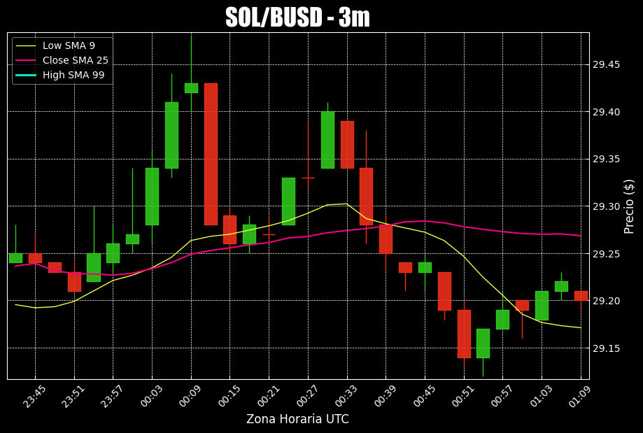
Problem
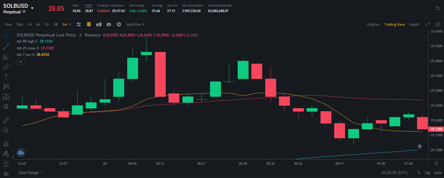
When comparing the chart printed by my script against the chart displayed by Binance:
It is evident that the largest moving average (the one of 99 value) was not plotted as such, or it was, but I think because of the size set (figratio=(10, 6)) for the same plot it ended up not appearing.
The Question
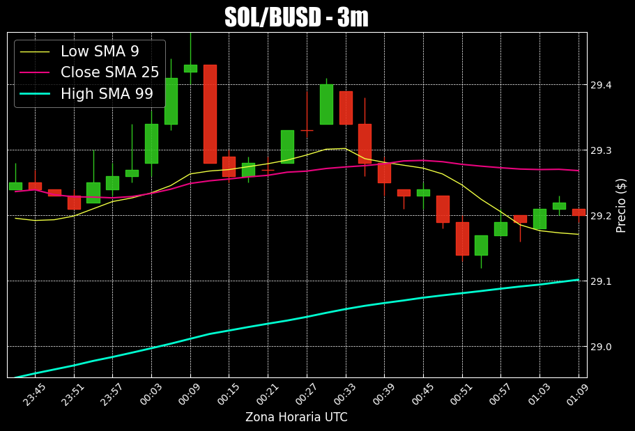
How could I make my script do a kind of Zoom out so that when printing the graph it shows the moving average of 99 without affecting the display of the other elements printed in the graph?.
I ended up finding an alternative which uses the set_ylim() method from MatPlotLib, the secret sauce lies within the following lines:
# Set the y axis range
ymin_value = df_trading_pair[['Low Price','Low SMA 9','Close SMA 25', 'High SMA 99']].min(axis=1).min()
ymax_value = df_trading_pair[['High Price','Low SMA 9','Close SMA 25', 'High SMA 99']].max(axis=1).max()
axlist[0].set_ylim([ymin_value,ymax_value]) #this solves the issue
By setting a fixed range of values that includes the minimum value from the ['Low Price','Low SMA 9','Close SMA 25', 'High SMA 99'] columns and the maximum value from the ['High Price','Low SMA 9','Close SMA 25', 'High SMA 99'] columns, it assures that this program will properly handle the plotting of the data stored in df_trading_pair and df_trading_pair_date_time_index for any given context (I suppose)
Script
# Plotting
# Create my own `marketcolors` style:
mc = mpf.make_marketcolors(up='#2fc71e',down='#ed2f1a',inherit=True)
# Create my own `MatPlotFinance` style:
s  = mpf.make_mpf_style(base_mpl_style=['bmh', 'dark_background'],marketcolors=mc, y_on_right=True)

# Plot it
# First create a dictionary to store the plots to add
subplots = {'Low SMA 9': mpf.make_addplot(df_trading_pair['Low SMA 9'], width=1, color='#F0FF42'),
            'Close SMA 25': mpf.make_addplot(df_trading_pair['Close SMA 25'], width=1.5, color='#EA047E'),
            'High SMA 99': mpf.make_addplot(df_trading_pair['High SMA 99'], width=2, color='#00FFD1')}

trading_plot, axlist = mpf.plot(df_trading_pair_date_time_index,
                    figratio=(10, 6),
                    type="candle",
                    style=s,
                    tight_layout=True,
                    datetime_format = '%H:%M',
                    ylabel = "Precio ($)",
                    returnfig=True,
                    show_nontrading=True,
                    addplot=list(subplots.values())
                    )

# Add Title
symbol = trading_pair.replace("BUSD","")+"/"+"BUSD"
axlist[0].set_title(f"{symbol} - 3m", fontsize=25, style='italic', fontfamily='fantasy')

# Find which times should be shown every 6 minutes starting at the last row of the df
x_axis_minutes = []
for i in range (1,len(df_trading_pair_date_time_index),2):
    x_axis_minutes.append(df_trading_pair_date_time_index.index[-i].minute)

# Set the main "ticks" to show at the x axis
axlist[0].xaxis.set_major_locator(mdates.MinuteLocator(byminute=x_axis_minutes))

# Set the x axis label
axlist[0].set_xlabel('Zona Horaria UTC')
# Set the y axis range
ymin_value = df_trading_pair[['Low Price','Low SMA 9','Close SMA 25', 'High SMA 99']].min(axis=1).min()
ymax_value = df_trading_pair[['High Price','Low SMA 9','Close SMA 25', 'High SMA 99']].max(axis=1).max()
axlist[0].set_ylim([ymin_value,ymax_value])

# Set the SMA legends
# First set the amount of legends to add to the legend box
axlist[0].legend([None]*(len(subplots)+2))
# Then Store the legend objects in a variable called "handles", based on this script, your objects to legend will appear from the third element in this list
handles = axlist[0].get_legend().legendHandles
# Finally set the corresponding names for the plotted SMA trends and place the legend box to the upper left corner in the bigger plot
axlist[0].legend(handles=handles[2:],labels=list(subplots.keys()), loc = 'upper left', fontsize = 15)
Output:
- How to resolve Python package dependencies with pipenv?
- NameError: global name 'unicode' is not defined - in Python 3
- PyAutoGui gives PERMISSION ERROR while mimmicking mouse clicks after Ubuntu update
- Completely uninstall Python 3 on Mac
- How can I improve the efficiency of matrix multiplication in python?
- cloudcompare mount hard drive issue
- How to print list of strings but skip the first item / jump to the second item?
- Difference between mock.patch.dict as function decorator and context manager in Python unittest
- Do I have to install packages needed each time when I start Google Colab?
- Errors when trying to solve large system of PDEs
- No Python 3.8 installation was detected
- Difference between dictionary and OrderedDict
- Storing and printing an exception with traceback?
- Reading Excel file from Azure Databricks
- Make python3 as my default python on Mac
- How to group contours and draw a single bounding rectangle
- How to reproduce results when using dropout regularization in Tensorflow
- requests.exceptions.ConnectionError: ('Connection aborted.', ConnectionResetError(104, 'Connection reset by peer')), Python
- File corruption while writing using Pandas
- Implementing Oja's Learning rule in Hopfield Network using python
- Throttling Async Functions in Python Asyncio
- How to change the precision of the percentage in tqdm?
- Rolling 2 dice in Python and if they are the same number, roll again, and continuing
- Python version numbering scheme
- Convert the month difference into integer
- How to properly extract all duplicated rows with a condition in a Polars DataFrame?
- Can I return a single backslash in a JSON response in FastAPI?
- How to fix "undefined name" error message in Python?
- `df.query()` in polars?
- In string formatting can I replace only one argument at a time?