Animated reducing bar chart with gganimate
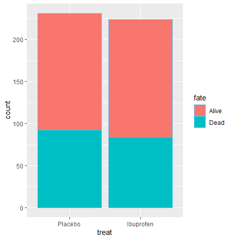
I have this basic plot of the Bernard dataset, that shows the mortality status by treatment.
library(tidyverse)
library(pubh)

Bernard %>% select(fate, treat, followup) %>%
  ggplot(aes(x = treat, fill = fate)) +
  geom_bar(stat = "count")
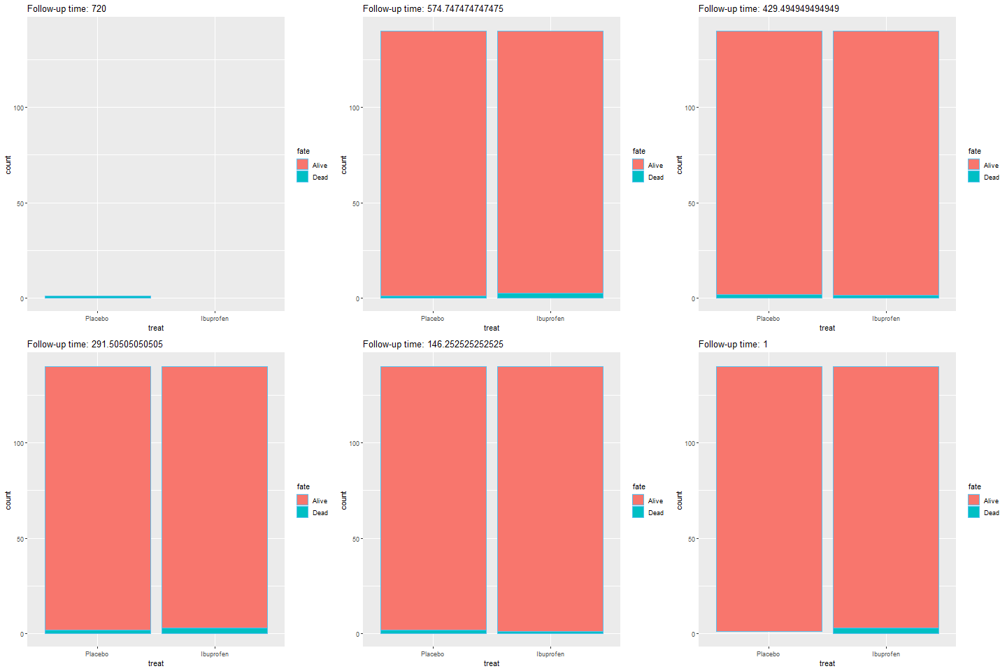
I would like an animated plot that adds the variable followup (1-720 hours) that runs backwards and shows how the count is affected.
Of course, this only affects the population of people who died (i.e. reducing their count), still I am interested in the concept, not so much the output.
I tried transition_reveal():
libary(gganimate)
Bernard %>% select(fate, treat, followup) %>%

  ggplot(aes(x = treat, fill = fate)) +
  geom_bar(stat = "count") +
  transition_reveal(-followup) +
  labs(title = "Follow-up time: {-frame_along}"
Solution
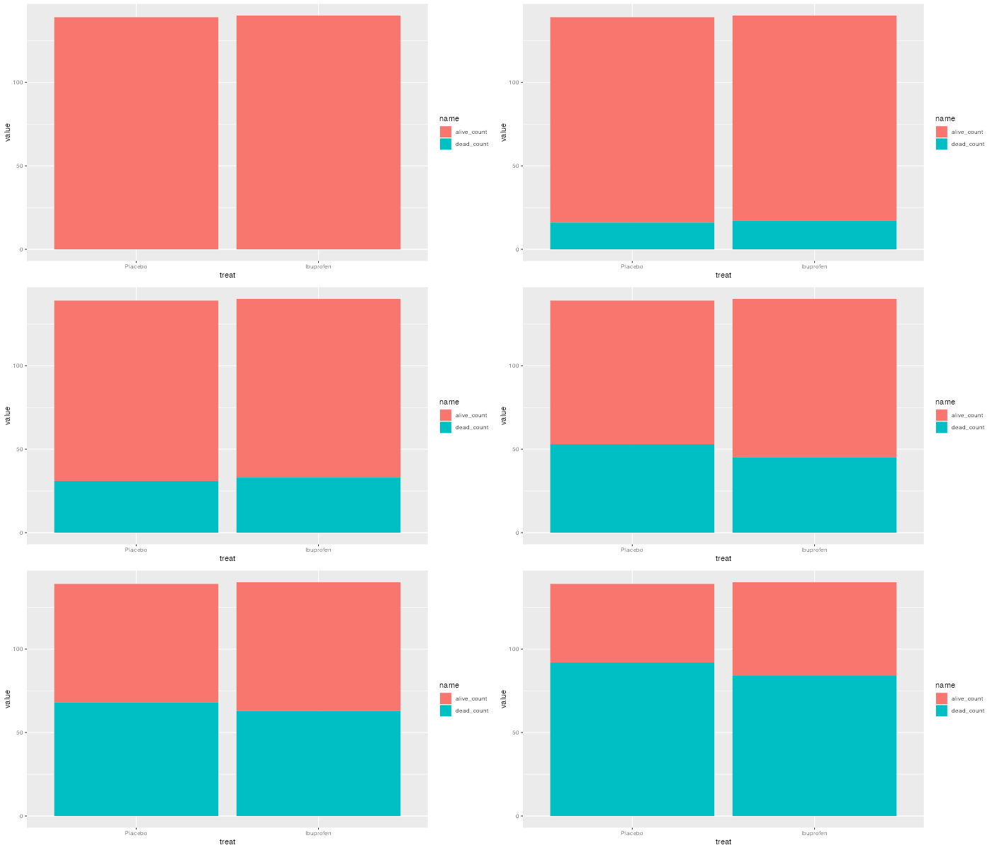
I'd suggest using some preprocessing to turn your "flows" data points (recorded deaths) into a "stock" (current counts of living participants). There's probably a more concise way to go about this but I hope it's clear what's happening:
library(tidyverse)
Bernard %>%
  count(treat, fate, followup) %>%
  mutate(status = n * if_else(fate == "Alive", 1, -1)) %>%
  group_by(treat) %>%
  arrange(-followup) %>%
  mutate(alive_count = cumsum(status),
         dead_count  = max(n) - alive_count) %>%
  ungroup() %>%
  select(treat, followup, alive_count, dead_count) %>%
  complete(treat, followup) %>%
  fill(ends_with("count")) %>%
  pivot_longer(alive_count:dead_count) %>%
  ggplot(aes(treat, value, fill = name)) +
  geom_col() +
  transition_manual(-followup)
- How to find correct projection of the shapefile data for leaflet map in r?
- How to use regex in R to shorten strings by one space
- R CRAN Check fail when using parallel functions
- Replacing several rows of data in a column efficiently using condition in a pipeline
- Iterate over vectors from an imported dataframe row-wise
- Split the legend into three rows with headings for a nested facet_wrap
- Why replace works with a boolean mask?
- Not able properly rasterize polygon dataset using terra::rasterize()
- Less than symbol ("<") in cloze schoice in Canvas (html select dropdown) shows as &lt;
- R/exams docx output does not include images
- How to have primitive discard additional arguments
- Functions Causing Objects to Disappear
- How to repel texts equidistantly on a secondary y-axis of a facet_grid?
- How can I add some text to a ggplot2 graph in R outside the plot area?
- Extracting Exact p-values from the "did" Package Output in R
- How can I set column types of several columns in empty R data frame?
- Adjust vertical line based on maximum value in graph plotly
- Combining Two Dataframes Based on Multiple Conditions & Removing Rows that Don't Match
- independent sample t-test in R using test statistics (mean, std. dev, count)
- How do I load a package without installing it in R?
- survcheck: 'x' must be an array of at least two dimensions
- Insert variable names and their specific values between the last column of facets and the strips of a facet_grid in R
- Use a recorded plot for officer
- Errors when using RStudio's Git tools
- Orientation of an irregular window changes the distance r over which secondary summary statistics are estimated
- Elegant way to check for missing packages and install them?
- How to create tmap labels along lines with rotated crs?
- How to access the value of a reactive output inside the browser console with jQuery?
- Convert excel column names to numbers
- How to adjust a node width in a Sankey plot in R?


