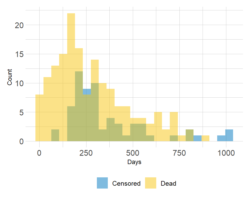
Plot distribution of follow-up times according to event status
I want to create a plot of the distribution of follow-up times of variable futime on x-axis according to event status in variable fustat on y-axis.
data(cancer, package="survival")
My attempt:
library(ggplot2)
ggplot(ovarian, aes(x = futime, fill = factor(fustat))) +
  geom_histogram(binwidth = 50) +
  labs(x = "Futime", y = "Count", fill = "Fustat") +
  scale_fill_manual(values = c("0" = "red", "1" = "blue")) +
  theme_minimal()
But how to get it more nicely like this
Thanks
Solution
Example with a built-in dataset as we don't have your data:
library(ggplot2)
ggplot(iris, aes(x = Sepal.Length, fill = factor(Species))) +
  geom_histogram(binwidth = 0.2, alpha = 0.4, position = "identity")
gives:

- How to group a flextable, a ggplot, a text and an image together into a grid object, then add it to a powerpoint slide
- Getting flextable to knit to PDF
- How to change the font of the first word in the footer of a flextable?
- Set a new header to the table dynamically from the labels of banner
- Create new column using group_by and adding number to value
- Aggregating Dataset to "ignore" categorical variable
- gt table tab spanner too long for table when knitting to pdf
- How to rename the target of a mutate statement
- making plotly subplots using crosstalk SharedData object
- Nested tabs in Quarto document
- Scrollbar Appears on kableExtra Tables with Download Button in Quarto — How to Remove?
- How to extract Std.Dev from VarCorr glmmTMB
- ggplot2 line chart gives "geom_path: Each group consist of only one observation. Do you need to adjust the group aesthetic?"
- How to properly combine two ggplots and properly align axis and strips/titles?
- Does the `by` argument in `avg_comparisons` compute the strata specific marginal effect?
- Add percentage labels to a bar chart
- How to remove excessive whitespace between columns in flextable?
- Cannot print crosstab with RMarkdown for a pdf document
- Seasonal Adjustment fails in newer versions or R
- dplyr if_any and numeric filtering?
- rcompanion::cldList() I am trying to re order CldList output to match figures order, and start with the group that my figure starts with
- How to hide/show a shinyWidgets dropdown with shinyjs?
- Create a dataframe column containing a list of number whose length is determined by another column
- How to avoid overlapping of legend types in ggplot2
- R lordif Rmarkdown
- r dplyr::left_join using datetime columns does not join properly
- Shiny checkboxGroup change size of box
- Aggregate dataframe in R to get mean of groups based on "detect flag"
- How do I add alternating white and grey shading to a plot with categorical variables on the y-axis?
- Why is the flextable caption different from the data.frame caption in officedown::rdocx_document outputs?