why it is not possible use matplotlib.animation when data type within pandas dataframe is datetime due to your time stamp?
I'm experimenting with 1D time-series data and trying to reproduce the following approach via animation over my own data in GoogleColab notebook.
I faced the problem of re-producing animation from this post when you pass data type of column list values as 'datetime' with dataframe when the x-axis is timestamp! I assume there is a bug somewhere even when I try to index timestamp column and anime the plots in which x-axis values passed by using df.index.
what I have tried unsuccessfully following scripts based on learning from my post available in reference at the end of my post:
#-----------------------------------------------------------
# Libs
#-----------------------------------------------------------
import numpy as np
import pandas as pd
import matplotlib.pyplot as plt
from matplotlib.animation import FuncAnimation
from matplotlib.patches import Rectangle
from IPython.display import HTML

#-----------------------------------------------------------
# LOAD THE DATASET
#-----------------------------------------------------------

df = pd.read_csv('https://raw.githubusercontent.com/amcs1729/Predicting-cloud-CPU-usage-on-Azure-data/master/azure.csv')
df['timestamp'] =  pd.to_datetime(df['timestamp'])
df = df.rename(columns={'min cpu': 'min_cpu',
                        'max cpu': 'max_cpu',
                        'avg cpu': 'avg_cpu',})
df.head()


# Data preparation
# ==============================================================================
sliced_df = df[['timestamp', 'avg_cpu']]
# convert column to datetime object
#sliced_df['timestamp'] = pd.to_datetime(sliced_df['timestamp'], format='%Y-%m-%d %H:%M:%S')
#df = df.set_index('timestamp')


step_size = 4*287
data_train = sliced_df[:-step_size]
data_test  = sliced_df[-step_size:] #unseen


#-----------------------------------------------------------
# Animation
#-----------------------------------------------------------

# create plot
plt.style.use("ggplot")  # <-- set overall look
fig, ax = plt.subplots( figsize=(10,4))

# plot data
plt.plot(list(sliced_df['timestamp']), sliced_df['avg_cpu'], 'r-', linewidth=0.5,  label='data or y')

# make graph beautiful
plt.plot([], [], 'g-', label="Train", linewidth=8, alpha=0.3)
plt.plot([], [], 'b-', label="Test",  linewidth=8, alpha=0.3)

step_size = 287
selected_ticks = sliced_df['timestamp'][::step_size]
plt.xticks(selected_ticks, rotation=90)
#plt.gca().xaxis.set_major_formatter(mdates.DateFormatter('%Y-%m-%d %H:%M:%S'))


Y_LIM       = 2*10**8 #df[f'{name_columns}'].max()
TRAIN_WIDTH =  288*27
TEST_WIDTH  =  357*1
print(TRAIN_WIDTH)
print(TEST_WIDTH)

#plt.title(f'Data split:\n taraing-set {100*(len(data_train)/len(df)):.2f}% = {TRAIN_WIDTH/288:.2f} days and test-set {100*(len(data_test)/len(df)):.2f}% = {TEST_WIDTH/288:.f} days')
plt.title(f'Data split:\n taraing-set % =  days and test-set % = days')
plt.ylabel(f' usage',   fontsize=15)
plt.xlabel('Timestamp', fontsize=15)
plt.grid(True)
#plt.legend(loc="upper left")
plt.legend(bbox_to_anchor=(1.3,.9), loc="upper right")
fig.tight_layout(pad=1.2)


def init():
    rects = [Rectangle((0, 0)              , TRAIN_WIDTH, Y_LIM, alpha=0.3, facecolor='green'),
             Rectangle((0 + TRAIN_WIDTH, 0), TEST_WIDTH,  Y_LIM, alpha=0.3, facecolor='blue')]
    patches = []
    for rect in rects:
            patches.append(ax.add_patch(rect))
    return patches

def update(x_start):
    patches[0].xy = (x_start, 0)
    patches[1].xy = (x_start + TRAIN_WIDTH, 0)
    return patches


# create "Train" and "Test" areas
patches = init()

ani = FuncAnimation(
    fig,
    update,
    frames= np.linspace(0, 288, 80),  # all starting points
    interval=50,
    blit=True)


HTML(ani.to_html5_video())
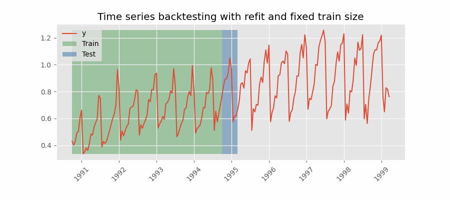
My current output:

Expected animation output (but with full timestamp):
Reference:
The problem is that green and blue Patches you want to draw are relative to Axes, but your graph data are having values of themselves. You need to translate your data to Matplotlib plot coordinates.
Below you can find a very naive and hacky approach, but it should give you a general idea how to handle it:
plt.style.use("ggplot")  # <-- set overall look
fig, ax = plt.subplots( figsize=(10,4))

# plot data
plt.plot(list(sliced_df['timestamp']), sliced_df['avg_cpu'], 'r-', linewidth=0.5,  label='data or y')

# translate data to graph coordinates
ax.margins(x=0, y=0)
x_min, x_max = ax.get_xlim()
y_min, y_max = ax.get_ylim()
ax.margins(x=0.05, y=0.05)
height = y_max-y_min

def init():
    rects = [Rectangle((x_min, y_min), 5,  height, alpha=0.3, facecolor='green'),
             Rectangle((x_min+5, y_min), 3,  height, alpha=0.3, facecolor='blue')]
    patches = []
    for rect in rects:
            patches.append(ax.add_patch(rect))
    return patches

def update(x_start):
    patches[0].xy = (x_start, y_min)
    patches[1].xy = (x_start + 5, y_min)
    return patches

patches = init()
ani = FuncAnimation(
    fig,
    update,
    frames= np.linspace(x_min, x_max-0.25*(x_max-x_min), 50),  # all starting points
    interval=150,
    blit=True)

HTML(ani.to_html5_video())
- Python, Web Scraping
- Cannot scrape xpath using Selenium
- Scrapy script not scraping items
- why does the html all have same class and sub-class with different information
- Yfinace - Getting Too Many Requests. Rate limited. Try after a while
- Requests and BeautifulSoup to get video length from YouTube
- web scraping Proplem no such element
- Python/Selenium - Scraping Into Excel Sheet
- Scraping data using Network, Fetch, Response
- Python NLTK: Bigrams trigrams fourgrams
- Discovering Poetic Form with NLTK and CMU Dict
- Python Wand: MagickReadImage returns false, but did not raise ImageMagick exception
- Executing multi-line statements in the one-line command-line
- How to get the replit link for uptime robot?
- How to install TA-Lib On vscode/windows(64bit)
- Python injector doesn't work for NewType based on tuple[str, str]
- Python conditional list joins
- Why Can't VS Code Directly Run Python unittest .py's Or Discover In Testing Tab
- Limiting amount of objects user can add in another object
- I got warning as: "Name 'x' can be undefined" and "Global variable 'x' is undefined at the module level"
- How to split data into 3 sets (train, validation and test)?
- How can I set session details in conftest.py for yield along with fixture in pytest?
- Show DataFrame as table in iPython Notebook
- How to get all possible (2^N) combinations of a list’s elements, of any length
- Python Declare variables iteratively
- Quarto Unable to Render Python
- Filter pandas dataframe with specific column names in python
- Tkinter canvas image probably being garbage collected but creating a persistent reference does not solve the problem
- Why is Pipenv not picking up my Pyenv versions?
- Why do I get lots of terminal messages about files 'first seen with mtime' when starting django runserver?