How to add text outside the panel when using ggplot coord_polar()?
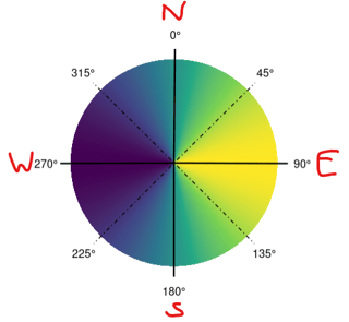
I want to create a plot that serves as a circular legend for a continuous variable. Additionally, I need to add text outside the panel, specifically below the x-axis (outside the circle). However, since I am using coord_polar(), functions like annotate() and geom_text() do not behave as they normally would. Does anyone have suggestions on how to address this issue?
Here is the data:
# DATA
aspect_class = data.frame(from = c(0, seq(22.5, 337.5, by = 45)),
                          to =   c(seq(22.5, 337.5, by = 45), 360),
                          mid = seq(0, 360, by = 45),
                          class = c("North (0°-22.5°)",
                                    "Northeast (22.5°-67.5°)",
                                    "East (67.5° - 112.5°)",
                                    "Southeast (112.5°-157.5°)",
                                    "South (157.5°-202.5°)",
                                    "Southwest (202.5°-247.5°)",
                                    "West (247.5°-292.5°)",
                                    "Northwest (292.5°-337.5°)",
                                    "North (337.5°-360°)"))

degrees = seq(0, 360, by = 1)
values = sin(degrees * pi / 180)
aspect_legend_df = data.frame(degrees, values)
compas = data.frame(degrees = seq(0,315,45),
                    direction = c("N", "NE", "E", "SE", "S", "SW", "W", "NW"))
and the plot code:
# PLOT
ggplot() +
  geom_tile(data = aspect_legend_df,
            aes(x = degrees, y = 0, fill = values),
            width = 1, height = 0.1) +
  scale_x_continuous(breaks = compas$degrees,
                     labels = ~ paste0(.x, "\u00B0"),
                     name = "Aspect [°]") +
  scale_fill_viridis_c() +
  geom_vline(data = aspect_class[aspect_class$mid %in% c(0, 90, 180, 270),],
             aes(xintercept = mid),
             color = "black", linewidth = 0.8) +
  geom_vline(data = aspect_class[!aspect_class$mid %in% c(0, 90, 180, 270, 360),],
             aes(xintercept = mid),
             color = "black", linewidth = 0.5, linetype = "dotdash") +
  annotate(geom = "text", x = compas$degrees, y = 0.06, label = "") +
  coord_polar(start = 0) +
  theme_minimal() +
  theme(legend.position = "none",
        axis.title = element_blank(),
        axis.text.y = element_blank(),
        panel.grid.major = element_blank(),
        panel.grid.minor = element_blank(),
        axis.text.x = element_text(size = 12, color = "black"))
I want to get this:
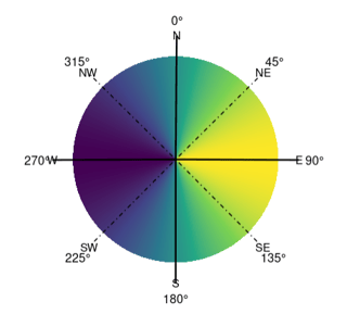
If I use annotate(geom = "text", x = compas$degrees, y = 0.06, label = compas$direction) + I get:
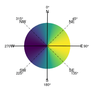
If I use geom_text(data = compas,aes(x = degrees, y = 0.06, label = direction), inherit.aes = FALSE, size = 5) I get:
There are a few ways of doing this.
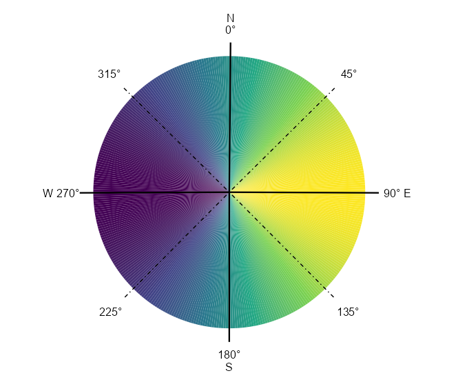
The simplest is just to specify the x axis labels with line breaks and spaces, though this does not allow you to customize the font size, color, etc.
For example, if you use your own code but specify the x axis as follows:
scale_x_continuous(breaks = compas$degrees,
                   labels = c("N\n0°", "45°", "90° E", "135°", "180°\nS",
                              "225°", "W 270°", "315°"))
You get
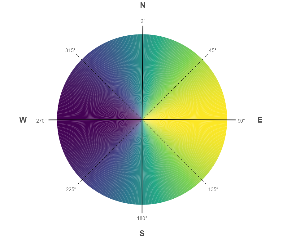
A somewhat more sophisticated approach would be to use library(ggtext) and employ element_markdown() to adjust sizes, spacing, color etc. I found I had to switch to coord_radial to get this working properly.
library(ggtext)

ggplot() +
  geom_tile(data = aspect_legend_df,
            aes(x = degrees, y = 0, fill = values),
            width = 1, height = 0.1) +
  scale_x_continuous(breaks = compas$degrees,
     labels = c("<span style = 'font-size:20pt'>**N**</span><br><br><br>0°",
                "45°",
                "<span>90°</span>
                <span style = 'color:white'>AA</span>
                <span style = 'font-size:20pt'>**E**</span>", "135°",
                "180°<br><br><br><span style = 'font-size:20pt'>**S**</span>",
                "225°",
                "<span style = 'font-size:20pt'>**W**</span>
                <span style = 'color:white'>AA</span>270°", "315°"),
                name = "Aspect [°]") +
  scale_fill_viridis_c() +
  geom_vline(data = aspect_class[aspect_class$mid %in% c(0, 90, 180, 270),],
             aes(xintercept = mid),
             color = "black", linewidth = 0.8) +
  geom_vline(data = aspect_class[!aspect_class$mid %in% c(0, 90, 180, 270, 360),],
             aes(xintercept = mid),
             color = "black", linewidth = 0.5, linetype = "dotdash") +
  annotate(geom = "text", x = compas$degrees, y = 0.06, label = "") +
  coord_radial(start = 0, expand = FALSE) +
  theme_minimal() +
  theme(legend.position = "none",
        axis.title = element_blank(),
        axis.text.y = element_blank(),
        panel.grid.major = element_blank(),
        panel.grid.minor = element_blank(),
        axis.text.theta = element_markdown(size = 12))
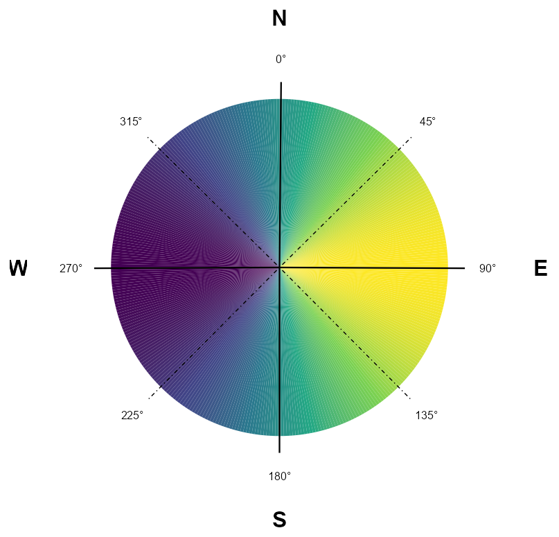
However, for ultimate control it might be best to draw the labels on using patchwork:
library(grid)
library(patchwork)

p <- ggplot(aspect_legend_df, aes(degrees, 0, fill = values)) +
  geom_tile(width = 1, height = 0.1) +
  geom_vline(xintercept = seq(0, 270, 90), lwd = 0.8) +
  geom_vline(xintercept = seq(45, 315, 90), lwd = 0.5, linetype = "dotdash") +
  scale_x_continuous(breaks = seq(0, 315, 45), labels = ~sprintf("%d°", .x)) +
  scale_y_continuous(limits = c(-0.05, 0.06)) +
  scale_fill_viridis_c(guide = "none") +
  coord_polar(start = 0) +
  theme_void() +
  theme(axis.text.x = element_text(size = 12, color = "black"))

NESW <- lapply(c("N", "E", "S", "W"), function(x) {
  wrap_elements(textGrob(x, gp = gpar(cex = 2, font = 2)))
})

plot_spacer() + NESW[[1]] + plot_spacer() +
  NESW[[4]] + p + NESW[[2]] +
  plot_spacer() + NESW[[3]] + plot_spacer() +
  plot_layout(heights = c(1, 30, 1), widths = c(1, 30, 1))
- How to find correct projection of the shapefile data for leaflet map in r?
- How to use regex in R to shorten strings by one space
- R CRAN Check fail when using parallel functions
- Replacing several rows of data in a column efficiently using condition in a pipeline
- Iterate over vectors from an imported dataframe row-wise
- Split the legend into three rows with headings for a nested facet_wrap
- Why replace works with a boolean mask?
- Not able properly rasterize polygon dataset using terra::rasterize()
- Less than symbol ("<") in cloze schoice in Canvas (html select dropdown) shows as &lt;
- R/exams docx output does not include images
- How to have primitive discard additional arguments
- Functions Causing Objects to Disappear
- How to repel texts equidistantly on a secondary y-axis of a facet_grid?
- How can I add some text to a ggplot2 graph in R outside the plot area?
- Extracting Exact p-values from the "did" Package Output in R
- How can I set column types of several columns in empty R data frame?
- Adjust vertical line based on maximum value in graph plotly
- Combining Two Dataframes Based on Multiple Conditions & Removing Rows that Don't Match
- independent sample t-test in R using test statistics (mean, std. dev, count)
- How do I load a package without installing it in R?
- survcheck: 'x' must be an array of at least two dimensions
- Insert variable names and their specific values between the last column of facets and the strips of a facet_grid in R
- Use a recorded plot for officer
- Errors when using RStudio's Git tools
- Orientation of an irregular window changes the distance r over which secondary summary statistics are estimated
- Elegant way to check for missing packages and install them?
- How to create tmap labels along lines with rotated crs?
- How to access the value of a reactive output inside the browser console with jQuery?
- Convert excel column names to numbers
- How to adjust a node width in a Sankey plot in R?
