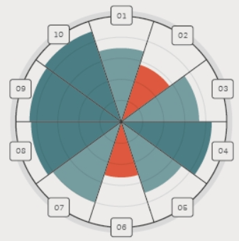
ggplot2: Circular barplot manipulation for scalability
Preamble: I recently having this thread
Goal
Replicating this plot
Current code
library(tidyverse)

data <- data.frame(
  labels = c("A","B","C","D","E","F","G","H"),
  values = c(88, 61, 56, 77, 83, 63, 42, 60)
) %>%
  mutate(
    bar_color = case_when(
      values < 62 ~ "#f2452e",
      values < 85 ~ "#76c5d0",
      values >= 85 ~ "#4b7d84",
    )
  )

ggplot(data, aes(x = labels, y = values)) +
  geom_bar(aes(fill = bar_color),
           stat = "identity", size = 1,
           color = "gray20", width = 1,
           alpha = 0.8) +
  coord_polar(start = -(pi / 8)) +
  scale_fill_identity() +
  theme(
    panel.grid.major.y = element_line(
      linewidth = .8,
      color = c("transparent", alpha("grey80", 0.5))
    ),
    axis.title = element_blank(),
    panel.background = element_blank(),
    axis.ticks.y = element_blank(),
    axis.text = element_blank(),
  ) +
  geom_hline(yintercept = 96.5,
             color = "grey90", size = 3) +
  scale_y_continuous(breaks = seq(0, 95, 5)) +
  geom_segment(aes(x = 1.5:8.5, y = 0, yend = 95),
               inherit.aes = FALSE, color = alpha("grey20", 0.5)) +
  geom_hline(yintercept = 94,
             color = "grey20", size = 1) +
  geom_label(aes(label = labels, y = 96), fill = "white", size = 6)
Current plot:
Problem
The value of:
breaksinscale_y_continuous()yinterceptingeom_hline()yendingeom_segment(); andyingeom_label()
Is all hardcoded. It become challenge when data$values changing, especially above 95 (max is 100). I need help on making sure that the values of problem #1 to #4 stays at around 100 to cover all possible values of data$values
Example of issue
I change the value of above's parameters to around 99-100 because i want to make the length of bar relative to 0 - 100.
breaks = seq(0, 100, 5)yintercept = 101.5in the firstyintercept = 99in the secondgeom_hline()yend = 100ingeom_segment(); andy = 101ingeom_label()
so become this:
ggplot(data, aes(x = labels, y = values)) +
  geom_bar(aes(fill = bar_color),
           stat = "identity", size = 1,
           color = "gray20", width = 1,
           alpha = 0.8) +
  coord_polar(start = -(pi / 8)) +
  scale_fill_identity() +
  theme(
    panel.grid.major.y = element_line(
      linewidth = .8,
      color = c("transparent", alpha("grey80", 0.5))
    ),
    axis.title = element_blank(),
    panel.background = element_blank(),
    axis.ticks.y = element_blank(),
    axis.text = element_blank(),
  ) +
  geom_hline(yintercept = 101.5,
             color = "grey90", size = 3) +
  scale_y_continuous(breaks = seq(0, 100, 5)) +
  geom_segment(aes(x = 1.5:8.5, y = 0, yend = 100),
               inherit.aes = FALSE, color = alpha("grey20", 0.5)) +
  geom_hline(yintercept = 99,
             color = "grey20", size = 1) +
  geom_label(aes(label = labels, y = 101), fill = "white", size = 6)
New result is like this:
Notice that theres extra circle in the outer line and i kinda struggle with this
I would do away with a background grid altogether and draw the breaks yourself. It is not clear from your question whether you want to normalize the values so that the maximum value is always at 100. If so, you would do:
library(tidyverse)

data <- data.frame(labels = c("A","B","C","D","E","F","G","H"),
                   values = c(88, 61, 56, 77, 83, 63, 42, 60)) %>%
        mutate(bar_color = case_when(values < 62 ~ "#de583f",
                                     values < 85 ~ "#759d9f",
                                     values >= 85 ~ "#4b7d84",))

scaling_factor <- max(data$values)

ggplot(data %>% mutate(values = values / scaling_factor),
       aes(labels, values, fill = bar_color)) +
  geom_col(width = 1, aes(color = after_scale(fill))) +
  annotate("linerange", ymin = 0, ymax = 1, x = seq(nrow(data)) - 0.5,
           color = "#494949") +
  geom_hline(yintercept = c(0, 2, 4, 6, 8) / 10, color = "#494949", alpha = 0.2) +
  geom_hline(yintercept = 1.02, color = "#d9d9d9", linewidth = 4) +
  geom_hline(yintercept = 1, color = "#494949") +
  geom_label(aes(y = 1, label = labels), fill = "#edecea", color = "#494949",
             size = 8, family = "Courier New") +
  scale_fill_identity() +
  coord_polar(start = -pi/8) +
  theme_void() +
  scale_y_continuous(limits = c(0, 1.1), expand = c(0, 0)) +
  theme(plot.background = element_rect(fill = "#edecea", color = NA))
If the numbers are absolute values and you want the range of your plot to be 100, just change the line scaling_factor <- max(data$values) to scaling_factor <- 100. Then the exact same plotting code will give you:
- Simple question: how to add text to r chunk in rmd format?
- Issue with Label Behaviour in gganimate
- Combine census tracts with neighbor to reach a population threshold in R
- Creating a single map composed of three separate shapefiles
- Implementation of Cobb-Douglas Utility Function to calculate Receiver Operator Curve & AUC
- Overall percentages based on total count
- Pairwise dissimilarities nesting a time-series loop inside a site loop - multiple times
- Long/Lat points keep ending up in Kansas
- How to sum a column dependent on a value in another column
- Customize label for an Interaction Plot
- How to obtain RMSE out of lm result?
- Faceted mosaic plots with the same area scaling
- Unite columns with unique values
- How to print the current map while preserving data points
- How to solve error: mismatched lengths of ids and values when data has missing values in geom_line_interactive()?
- How do I transfer NAs from one dataframe to same position in a second dataframe
- Creating bar plots using ggplot, running into issues with data format
- Force initial zoom to truncate portion of the data
- R - select only factor columns of dataframe
- How to scale the units of the data & trend components of an autoplot of a multiplicative decomposition of a time series?
- Respect ratio when using ggarrange() and geom_sf()
- Changing size / aspect ratio of leaflet
- How do I use the lubridate package to calculate the number of months between two date vectors where one of the vectors has NA values?
- Adding to logos to flexdashboard
- R replace values of a column based on exact match of another data frame
- Error in grepl(pattern, df): invalid regular expression
- regular expression in R, reuse matched string in replacement
- Substract minimum value of row from each element of row in dataframe,
- R Reticulate does work with for loop but not purrr::map2
- Count all values in a correlation matrix that are above 0.8 and below -0.8


