Make an element sticky until a specific amount of the remaining container height is reached
How can an element be defined to behave like a sticky element only when the remaining height of the element is greater than a specific size (that I will call sticky container margin)?
For example, in the below image:
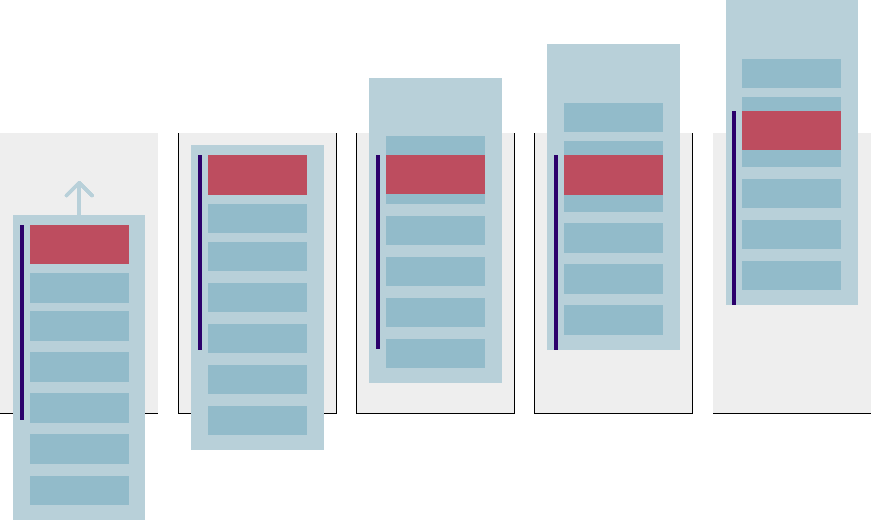
You can see that the light blue container has a sticky red element, and the sticky container margin is showed as a dark blue line. When the container element is leaving the screen, the red element stays sticky until the sticky container margin reaches the end of the container.
Here is an initial code to try out some solutions. I tried to make the blue line a container, but that messes up the initial position of the rest of the content.
section {
  height: 300lvh;
}

.content {
  background: #eee;
  height: 80lvh;
}

.box {
  height: 120lvh;
  background: #9f9;
  display: flex;
  flex-direction: column;
}

.sticky {
  position: sticky;
  top: 0px;
  height: 20lvh;
  background: #99f;
}

.end {
  color: red;
  padding-top: 50px;
}

.flex-end {
  flex-grow: 1;
  display: flex;
  flex-direction: column;
  justify-content: flex-end;
}
<section>
<div class="content">Prev content</div>
<div class="box">
<div class="sticky">
Sticky element
</div>
<div>
Content
</div>
<div class="flex-end">
Content
</div>
</div>
<div class="content end">
When this is visible, the sticky element should go up
</div>
</section>Solution
I would play with some margin
section {
  height: 300lvh;
}

.content {
  background: #eee;
  height: 80lvh;
}

.box {
  height: 120lvh;
  background: #9f9;
  display: flex;
  flex-direction: column;
}

.sticky {
  position: sticky;
  top: 0px;
  height: 20lvh;
  margin-bottom: 80lvh; /* here */
  background: #99f;
}

.sticky + * {
  margin-top: -80lvh; /* and here */
}

.end {
  color: red;
  padding-top: 50px;
}

.flex-end {
  flex-grow: 1;
  display: flex;
  flex-direction: column;
  justify-content: flex-end;
}
<section>
<div class="content">Prev content</div>
<div class="box">
<div class="sticky">
Sticky element
</div>
<div>
Content
</div>
<div class="flex-end">
Content
</div>
</div>
<div class="content end">
When this is visible, the sticky element should go up
</div>
</section>- Select with search option in Bootstrap
- Display multiple text lines of equal length
- input type="date" appears larger on iPhone
- Finish faster CSS Animation
- jQuery Drop event not firing
- Display input field based on selected option
- How to set grid-row on grids that are subgrids?
- How to programmatically Download a file from Google Drive, using Javascript and HTML?
- Drag and drop API bugs/strange behavior on Firefox and Chrome
- Body {background-color} not working in external css?
- Flask Load New Page After Streaming Data
- How to set the default value of radio buttons after loading page?
- JQuery add/remove class is not working properly
- How to create inner and outside shadow effect button?
- How can I create the Netflix Hero Curved Divider with CSS Radial Gradient?
- Detecting when an iframe gets or loses focus
- CSS/Tailwind Scroll Snapping not working within scrollable flex container with sticky header
- html: open pdf and png in the browser, not to download it
- How to change label font size in streamlit
- How to split css shape in half vertically?
- How can I set the text on the right of a glyphicon into a Twitter BootStrap theme?
- HTML CSS Div Overflow & Position "fixed"
- HTML and CSS Background-image is not showing up
- CSS Grid/Flex Layout: Expandable stacked cards that should have specific height below fixed header with scrollable table content
- Is it possible to change the font of a st.button in Streamlit?
- How to send disabled checkbox value into database
- what's the current best way to put audio and video on a web site?
- How to stretch content vertically with grid?
- HTML tab interface using only CSS
- HTML to CHM file on Linux