Polar plot in R using ggplot2
I'm trying to plot a simple polar plot in R using ggplot2 and I'm struggled with strange behavior !
Here is my dataset :
wake_loss_per_sector
   sector wake_loss angle
1       1  16.48843    30
2       2  17.59385    60
3       3  19.19244    90
4       4  27.17434   120
5       5  26.13185   150
6       6  10.95055   180
7       7  11.09595   210
8       8  14.24783   240
9       9  15.59619   270
10     10  19.09893   300
11     11  22.63984   330
12     12  15.84240     0
And here how I try to plot it :
ggplot(wake_loss_per_sector, aes(x = angle, y = wake_loss)) +
  geom_col(width = 25, fill = "skyblue", color = "black") +
  coord_polar(start = 0) +
  scale_x_continuous(
    limits = c(0, 360),
    breaks = seq(0, 330, by = 30),
    minor_breaks = NULL
  ) +
  theme_minimal()
When It runs , it generate a warning :
Warning message:
Removed 1 rows containing missing values (`geom_col()`).
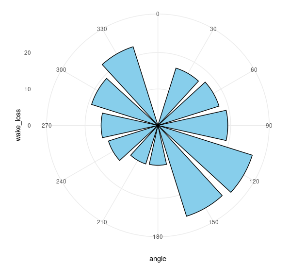
And the plot looks like the following with missing sector 12 (0 degree) :
Any suggestion is highly appreciated !
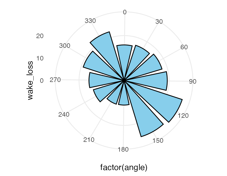
If all your bars are the same width and evenly spaced, as in this example, it's easier to use a discrete x (theta)--the defaults will work well for you.
We do need to set clip = "off" in coord_polar() so data going below 0 due to the width of the bar is still plotted. Your data resolution was at 30 and you set the width to 25, so for the discrete equivalent where the data resolution is 1 I set the width to 25 / 30.
ggplot(df, aes(x = factor(angle), y = wake_loss)) +
  geom_col(fill = "skyblue", color = "black", width = 25 / 30) +
  coord_polar(start = -.25, clip = "off") +
  theme_minimal()
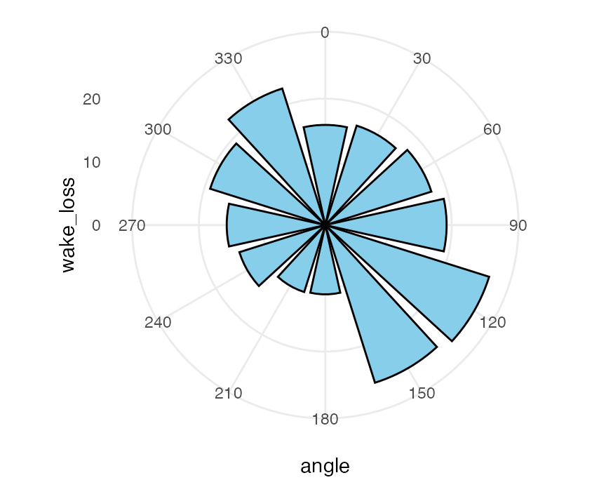
However, if you do need the continuous scale and you want to specify the width in data coordinates, you'll need to adjust the axis to account for the width of the bar centered at 0 to have half the width below 0. But to keep 0 at the top, you'll need to adjust the starting angle accordingly, in radians. It's a little obnoxious...
w = 25
ggplot(df, aes(x = angle, y = wake_loss)) +
  geom_col(fill = "skyblue", color = "black", width = w) +
  coord_polar(clip = "off", start = -w / 2 / 360 * 2 * pi) +
 scale_x_continuous(
    limits = c(-w / 2, 360 - w / 2),
    breaks = seq(0, 330, by = 30),
    minor_breaks = NULL
  ) +
  theme_minimal()
Using this sample data:
df = structure(list(sector = 1:12, wake_loss = c(16.48843, 17.59385,
19.19244, 27.17434, 26.13185, 10.95055, 11.09595, 14.24783, 15.59619,
19.09893, 22.63984, 15.8424), angle = c(30L, 60L, 90L, 120L,
150L, 180L, 210L, 240L, 270L, 300L, 330L, 0L)), class = "data.frame", row.names = c("1",
"2", "3", "4", "5", "6", "7", "8", "9", "10", "11", "12"))
- How to group a flextable, a ggplot, a text and an image together into a grid object, then add it to a powerpoint slide
- Getting flextable to knit to PDF
- How to change the font of the first word in the footer of a flextable?
- Set a new header to the table dynamically from the labels of banner
- Create new column using group_by and adding number to value
- Aggregating Dataset to "ignore" categorical variable
- gt table tab spanner too long for table when knitting to pdf
- How to rename the target of a mutate statement
- making plotly subplots using crosstalk SharedData object
- Nested tabs in Quarto document
- Scrollbar Appears on kableExtra Tables with Download Button in Quarto — How to Remove?
- How to extract Std.Dev from VarCorr glmmTMB
- ggplot2 line chart gives "geom_path: Each group consist of only one observation. Do you need to adjust the group aesthetic?"
- How to properly combine two ggplots and properly align axis and strips/titles?
- Does the `by` argument in `avg_comparisons` compute the strata specific marginal effect?
- Add percentage labels to a bar chart
- How to remove excessive whitespace between columns in flextable?
- Cannot print crosstab with RMarkdown for a pdf document
- Seasonal Adjustment fails in newer versions or R
- dplyr if_any and numeric filtering?
- rcompanion::cldList() I am trying to re order CldList output to match figures order, and start with the group that my figure starts with
- How to hide/show a shinyWidgets dropdown with shinyjs?
- Create a dataframe column containing a list of number whose length is determined by another column
- How to avoid overlapping of legend types in ggplot2
- R lordif Rmarkdown
- r dplyr::left_join using datetime columns does not join properly
- Shiny checkboxGroup change size of box
- Aggregate dataframe in R to get mean of groups based on "detect flag"
- How do I add alternating white and grey shading to a plot with categorical variables on the y-axis?
- Why is the flextable caption different from the data.frame caption in officedown::rdocx_document outputs?


