Is there a way to add an axis break in ggplot using scale_y_break
I am looking to add an axis break in ggplot at 1.0 to 2.5 on the Y scale with the top break smaller than the bottom break such as in the photo below.
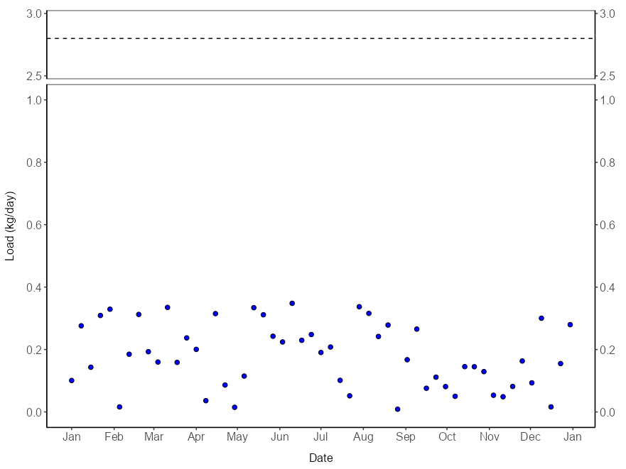
But when using the scale_y_break(c(1.0, 2.5)) it causes the two panels before/after the break to be the same scale causing the top panel to be too large. Is there anyway to fix this issue?
What I want.

what Im getting.

# Generate fake ammonia load data
set.seed(123)  # For reproducibility
dates <- seq(as.Date("2024-01-01"), as.Date("2024-12-31"), by="week")
ammonia_load <- runif(length(dates), min=0, max=0.35)  # Random data between 0 and 0.35

# Create a data frame
df <- data.frame(Date = dates, `Amonia Load` = ammonia_load)
df


### Change with separation !!!!!!!!!!!
# Create Top plot
Figure = ggplot(df, aes(x=Date, y=`Amonia.Load`)) +
  geom_point(color="black", fill="blue", shape=21, size=2) +
  labs(x="", y="Load (kg/day)") +
  theme_classic() +
  scale_x_date(date_breaks="1 month", date_labels="%b") +
  scale_y_continuous(limits=c(0.0, 3.0), breaks = c(0.0,0.2,0.4,0.6,0.8,1.0,2.5,3.0)) +
  theme(panel.border = element_rect(color="black", fill=NA, size=0.5), text = element_text(size=12), axis.text = element_text(size=12),
        axis.title = element_text(size=12)) +
  geom_hline(yintercept=2.8, linetype="dashed", color="black") +
  scale_y_break(c(1.0, 2.5))
Figure
The easiest way to do this is by adjusting your upper plot limit to, say, 2.7, and faking the upper y axis label to read "3".
You'll need to ensure your geom_hline is in the correct position to represent 2.8 in this scale (i.e. at y = 2.62, since 2.62 is three-fifths of the way between 2.5 and 2.7 just as 2.8 is three-fifths of the way between 2.5 and 3).
library(ggplot2)
library(ggbreak)

ggplot(df, aes(x = Date, y = `Amonia.Load`)) +
  geom_point(color = "black", fill = "blue", shape = 21, size = 2) +
  geom_hline(yintercept = 2.62, linetype = "dashed", color ="black") +
  scale_x_date(name = NULL, date_breaks = "1 month", date_labels = "%b") +
  scale_y_continuous(name   =  "Load (kg/day)",
                     limits = c(0.0, 2.7),
                     breaks = c(seq(0, 1, 0.2), 2.5, 2.7),
                     labels = c(seq(0, 1, 0.2), 2.5, 3)) +
  scale_y_break(breaks = c(1.0, 2.5)) +
  theme_classic() +
  theme(panel.border = element_rect(color = "black", fill = NA, size = 0.5),
        text         = element_text(size = 12),
        axis.text    = element_text(size = 12),
        axis.title   = element_text(size = 12))

This may seem a bit hacky, but it is far simpler than writing a new transformation object to apply to the axis. For completeness, here is how you would do it "properly"
library(scales)

transform_squeeze <- function(from, ratio) {

  new_transform("squeeze",
                transform = \(x) ifelse(x > from, (x - from)/ratio + from, x),
                inverse = \(x) ifelse(x > from, (x - from) * ratio + from, x))
}


ggplot(df, aes(x = Date, y = `Amonia.Load`)) +
  geom_point(color = "black", fill = "blue", shape = 21, size = 2) +
  geom_hline(yintercept = 2.8, linetype = "dashed", color ="black") +
  scale_x_date(name = NULL, date_breaks = "1 month", date_labels = "%b") +
  scale_y_continuous(name   =  "Load (kg/day)",
                     transform = transform_squeeze(2.5, ratio = 2.5),
                     limits = c(0.0, 3),
                     breaks = c(seq(0, 1, 0.2), 2.5, 3)) +
  scale_y_break(breaks = c(1.0, 2.5)) +
  theme_classic() +
  theme(panel.border = element_rect(color = "black", fill = NA, size = 0.5),
        text         = element_text(size = 12),
        axis.text    = element_text(size = 12),
        axis.title   = element_text(size = 12))
 Note that this gives identical visual results despite the increased complexity. However, it easily allows you to specify the threshold above which you start to compress the axis and the compression ratio to control the size of the upper panel, all without having to change your breaks, hline level and axis labels.
- Simple question: how to add text to r chunk in rmd format?
- Issue with Label Behaviour in gganimate
- Combine census tracts with neighbor to reach a population threshold in R
- Creating a single map composed of three separate shapefiles
- Implementation of Cobb-Douglas Utility Function to calculate Receiver Operator Curve & AUC
- Overall percentages based on total count
- Pairwise dissimilarities nesting a time-series loop inside a site loop - multiple times
- Long/Lat points keep ending up in Kansas
- How to sum a column dependent on a value in another column
- Customize label for an Interaction Plot
- How to obtain RMSE out of lm result?
- Faceted mosaic plots with the same area scaling
- Unite columns with unique values
- How to print the current map while preserving data points
- How to solve error: mismatched lengths of ids and values when data has missing values in geom_line_interactive()?
- How do I transfer NAs from one dataframe to same position in a second dataframe
- Creating bar plots using ggplot, running into issues with data format
- Force initial zoom to truncate portion of the data
- R - select only factor columns of dataframe
- How to scale the units of the data & trend components of an autoplot of a multiplicative decomposition of a time series?
- Respect ratio when using ggarrange() and geom_sf()
- Changing size / aspect ratio of leaflet
- How do I use the lubridate package to calculate the number of months between two date vectors where one of the vectors has NA values?
- Adding to logos to flexdashboard
- R replace values of a column based on exact match of another data frame
- Error in grepl(pattern, df): invalid regular expression
- regular expression in R, reuse matched string in replacement
- Substract minimum value of row from each element of row in dataframe,
- R Reticulate does work with for loop but not purrr::map2
- Count all values in a correlation matrix that are above 0.8 and below -0.8