feColorMatrix made circle disappear for a just while
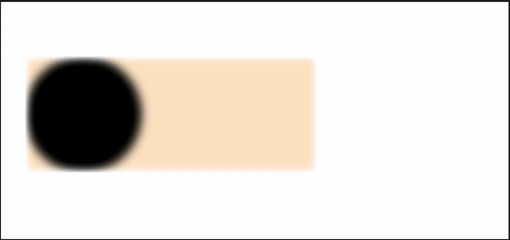
I wrote a piece of simple code to make a blur circle roll out of a container.
index.html:
<!DOCTYPE html>
<html lang="en">

<head>
    <meta charset="UTF-8">
    <meta name="viewport" content="width=device-width, initial-scale=1.0">
    <title></title>
    <link rel="stylesheet" href="style.css">
</head>

<body>
    <div class="container">
        <div class="circle"></div>
    </div>
    <svg>
        <filter id="flt">
            <feGaussianBlur in="SourceGraphic" stdDeviation="8"></feGaussianBlur>
            <feColorMatrix type="matrix" values="
            1 0 0 0 0
            0 1 0 0 0
            0 0 1 0 0
            0 0 0 2 -1
            "></feColorMatrix>
        </filter>
    </svg>
</body>

</html>
style.css:
* {
    margin: 0;
    padding: 0;
    box-sizing: border-box;
}

body {
    display: flex;
    justify-content: center;
    align-items: center;
    min-height: 100vh;
}

.container {
    position: relative;
    width: 500px;
    display: flex;
    filter: url(#flt);
    background-color: bisque;
}

.container .circle {
    background-color: #000;
    width: 200px;
    height: 200px;
    position: relative;
    border-radius: 50%;
    animation: leftM 5s ease-in-out 2s forwards;
}

svg {
    display: none;
}

@keyframes leftM {
    0% {
        transform: translateX(0px);
    }

    100% {
        transform: translateX(600px);
    }
}
If I commented out the "filter: url(#flt);" inside the ".container" in style.css, the black circle rolled out of the container as expected. However, the circle disappeared for a while during rolling if I added "filter: url(#flt);" back. I couldn't figure it out.


Solution
I was checking on codepen its working fine
.container .circle { background-color: #000; width: 200px; height: 200px; position: relative; border-radius: 50%; animation: leftM 5s ease-in-out 2s forwards; will-change: transform; z-index: 10;}
https://codepen.io/jojo129/pen/poVzxaK
- Stop embedded youtube iframe?
- How to make a flex child overflow its parent as it grows?
- Text not wrapping in paragraph element
- Check if checkbox is checked with jQuery
- Text selection inside inline-blocks without space between
- How do I make an HTML page print in landscape when the user selects 'print'?
- Set content of HTML <span> with Javascript
- How to create custom theme for Google Form?
- How to align two different font-sizes next to each other?
- Getting the values from dynamically created input(s) from a table
- How can I prevent the horizontal menu from breaking when the browser window resizes?
- Embeded YouTube video not available in iframe HTML
- Prevent iOS browser to enable full screen camera mode when streaming camera video
- How to style canvas elements with CSS
- Set date in input type date
- Making the side of a border “flattened” or angled inward, like a diagonal cut instead of a straight edge
- HTML5 canvas: is there a way to resize image with "nearest neighbour" resampling?
- How to refresh items on a page without page refresh in Flask
- How to allow webpage to modify user's svg file, safely?
- how to escape xml space in service?
- Trying to make buttons that set difficulty for a Canvas game
- Image flex item does not shrink height in a flexbox
- Is there a way to prevent a p-fieldset from autogenerating an aria-labelledby attribute?
- Why is a border around my HTML input submit button?
- Why is there a border at the top of my html page
- Favicon doesn't show on Google Search
- JavaScript replace and regexp syntax issue
- how to display web browser console in a webpage
- Double underline tag?
- How to overlay a play button over a thumbnail image using only CSS