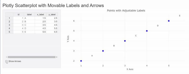
Manually adjust annotation label coordinates in R plotly
In a Shiny app with R plotly, how can I manually control the position of annotation labels by specifying x and y coordinates (using rhandsontable)? Additionally, is it possible to add arrows that adjust based on the updated coordinates? Below I provide simple example, without annotations.
library(shiny)
library(plotly)
library(rhandsontable)


ui <- fluidPage(
  titlePanel("Plotly Scatterplot with Movable Labels and Arrows"),
  sidebarLayout(
    sidebarPanel(
      rHandsontableOutput("table"),
      checkboxInput("show_arrows", "Show Arrows", value = TRUE)
    ),
    mainPanel(
      plotlyOutput("scatterplot")
    )
  )
)

server <- function(input, output, session) {

  dot_data <- data.frame(
    id = 1:5,
    label = c("A", "B", "C", "D", "E"),
    x_dot = c(1, 2, 3, 4, 5),
    y_dot = c(2, 3, 4, 5, 6)
  )

  label_data <- reactiveVal(data.frame(
    id = 1:5,
    label = c("A", "B", "C", "D", "E"),
    x_label = c(1, 2, 3, 4, 5),
    y_label = c(2, 3, 4, 5, 6)
  ))

  output$table <- renderRHandsontable({
    rhandsontable(label_data(), stretchH = "all", height = 300)
  })

  observeEvent(input$table, {
    new_data <- hot_to_r(input$table)
    label_data(new_data)
  })

  output$scatterplot <- renderPlotly({

    data <- label_data()

    plot <- plot_ly() %>%
      add_trace(
        data = dot_data,
        x = ~x_dot,
        y = ~y_dot,
        type = "scatter",
        mode = "markers",
        marker = list(size = 10, color = "blue")
      )

    plot
  })
}

# Run the application
shinyApp(ui = ui, server = server)
Solution
Not really sure, what the ShowArrow button should do - so I provided two options.
1
uses red line shapes which can be controlled via the showArrows button
library(shiny)
library(plotly)
library(rhandsontable)

ui <- fluidPage(
  titlePanel("Plotly Scatterplot with Movable Labels and Arrows"),
  sidebarLayout(
    sidebarPanel(
      rHandsontableOutput("table"),
      checkboxInput("show_arrows", "Show Arrows", value = TRUE)
    ),
    mainPanel(
      plotlyOutput("scatterplot")
    )
  )
)

server <- function(input, output, session) {

  dot_data <- data.frame(
    id = 1:5,
    label = c("A", "B", "C", "D", "E"),
    x_dot = c(1, 2, 3, 4, 5),
    y_dot = c(2, 3, 4, 5, 6)
  )

  label_data <- reactiveVal(data.frame(
    id = 1:5,
    label = c("A", "B", "C", "D", "E"),
    x_label = c(1.5, 2.5, 3.5, 4.5, 5.5),
    y_label = c(2.5, 3.5, 4.5, 5.5, 6.5)
  ))

  output$table <- renderRHandsontable({
    rhandsontable(label_data(), stretchH = "all", height = 300) %>%
      hot_col("id", readOnly = TRUE) %>%
      hot_col("label", readOnly = TRUE) %>%
      hot_col("x_label", format = "0.0") %>%
      hot_col("y_label", format = "0.0")
  })

  observeEvent(input$table, {
    new_data <- hot_to_r(input$table)
    label_data(new_data)
  })

  output$scatterplot <- renderPlotly({

    data <- label_data()

    # Create base plot with markers
    plot <- plot_ly() %>%
      add_trace(
        data = dot_data,
        x = ~x_dot,
        y = ~y_dot,
        type = "scatter",
        mode = "markers",
        marker = list(size = 10, color = "blue"),
        hoverinfo = "text",
        text = ~label,
        showlegend = FALSE
      ) %>%
      add_trace(    # Add labels
        x = data$x_label,
        y = data$y_label,
        type = "scatter",
        mode = "text",
        text = data$label,
        textposition = "middle center",
        textfont = list(size = 12),
        hoverinfo = "none",
        showlegend = FALSE
      ) %>%
      layout(
        xaxis = list(title = "X Axis"),
        yaxis = list(title = "Y Axis"),
        title = "Points with Adjustable Labels",
        hovermode = "closest"
      )

    if(input$show_arrows) {
      plot <- plot %>% layout(shapes = lapply(1:nrow(data), function(i) {
        list(
          type = "line",
          x0 = dot_data$x_dot[i],
          y0 = dot_data$y_dot[i],
          x1 = data$x_label[i],
          y1 = data$y_label[i],
          line = list(color = "red", width = 2),
          layer = "below"
        )
      }))
    }

    plot
  })
}

shinyApp(ui = ui, server = server)
2
uses annotations where showArrow is tied to the button showarrow = input$show_arrows

library(shiny)
library(plotly)
library(rhandsontable)

ui <- fluidPage(
  titlePanel("Plotly Scatterplot with Movable Labels and Arrows"),
  sidebarLayout(
    sidebarPanel(
      rHandsontableOutput("table"),
      checkboxInput("show_arrows", "Show Arrows", value = TRUE)
    ),
    mainPanel(
      plotlyOutput("scatterplot")
    )
  )
)

server <- function(input, output, session) {

  dot_data <- data.frame(
    id = 1:5,
    label = c("A", "B", "C", "D", "E"),
    x_dot = c(1, 2, 3, 4, 5),
    y_dot = c(2, 3, 4, 5, 6)
  )

  label_data <- reactiveVal(data.frame(
    id = 1:5,
    label = c("A", "B", "C", "D", "E"),
    x_label = c(1.5, 2.5, 3.5, 4.5, 5.5),
    y_label = c(2.5, 3.5, 4.5, 5.5, 6.5)
  ))

  output$table <- renderRHandsontable({
    rhandsontable(label_data(), stretchH = "all", height = 300) %>%
      hot_col("id", readOnly = TRUE) %>%
      hot_col("label", readOnly = TRUE) %>%
      hot_col("x_label", format = "0.0") %>%
      hot_col("y_label", format = "0.0")
  })

  observeEvent(input$table, {
    new_data <- hot_to_r(input$table)
    label_data(new_data)
  })

  output$scatterplot <- renderPlotly({

    data <- label_data()

    # Create base plot with markers
    plot <- plot_ly() %>%
      add_trace(
        data = dot_data,
        x = ~x_dot,
        y = ~y_dot,
        type = "scatter",
        mode = "markers",
        marker = list(size = 10, color = "blue"),
        hoverinfo = "text",
        text = ~label,
        showlegend = FALSE
      ) %>%
      layout(
        xaxis = list(title = "X Axis"),
        yaxis = list(title = "Y Axis"),
        title = "Points with Adjustable Labels",
        hovermode = "closest"
      )

    plot <- plot %>% layout(annotations = lapply(1:nrow(data), function(i) {
      list(
        x = dot_data$x_dot[i],
        y = dot_data$y_dot[i],
        text = data$label[i],
        showarrow = input$show_arrows,
        arrowhead = 2,
        arrowsize = 1,
        ax = data$x_label[i],
        ay = data$y_label[i],
        axref = "x",
        ayref = "y",
        xref = "x",
        yref = "y",
        font = list(size = 12),
        bgcolor = "white",
        bordercolor = "black",
        borderwidth = 1
      )
    }))


    plot
  })
}

shinyApp(ui = ui, server = server)
- Simple question: how to add text to r chunk in rmd format?
- Issue with Label Behaviour in gganimate
- Combine census tracts with neighbor to reach a population threshold in R
- Creating a single map composed of three separate shapefiles
- Implementation of Cobb-Douglas Utility Function to calculate Receiver Operator Curve & AUC
- Overall percentages based on total count
- Pairwise dissimilarities nesting a time-series loop inside a site loop - multiple times
- Long/Lat points keep ending up in Kansas
- How to sum a column dependent on a value in another column
- Customize label for an Interaction Plot
- How to obtain RMSE out of lm result?
- Faceted mosaic plots with the same area scaling
- Unite columns with unique values
- How to print the current map while preserving data points
- How to solve error: mismatched lengths of ids and values when data has missing values in geom_line_interactive()?
- How do I transfer NAs from one dataframe to same position in a second dataframe
- Creating bar plots using ggplot, running into issues with data format
- Force initial zoom to truncate portion of the data
- R - select only factor columns of dataframe
- How to scale the units of the data & trend components of an autoplot of a multiplicative decomposition of a time series?
- Respect ratio when using ggarrange() and geom_sf()
- Changing size / aspect ratio of leaflet
- How do I use the lubridate package to calculate the number of months between two date vectors where one of the vectors has NA values?
- Adding to logos to flexdashboard
- R replace values of a column based on exact match of another data frame
- Error in grepl(pattern, df): invalid regular expression
- regular expression in R, reuse matched string in replacement
- Substract minimum value of row from each element of row in dataframe,
- R Reticulate does work with for loop but not purrr::map2
- Count all values in a correlation matrix that are above 0.8 and below -0.8