How to ensure a shared x- and y-axis across multiple ggplot2 plots in patchwork
I am creating a 2x2 matrix of raster plots using ggplot2 and patchwork, where each plot is generated from a different dataset. I want to ensure that the x- and y-axis of these plots, which are equal, are only shown ones (like the example in this post or this post).
Here is my reproducible example:
library(ggplot2)
library(patchwork)

# Create different datasets for each plot
df1 <- expand.grid(x = seq(300, 800, length.out = 50), y = seq(300, 600, length.out = 50))
df1$z <- with(df1, dnorm(x, mean = 500, sd = 50) * dnorm(y, mean = 400, sd = 50))

df2 <- expand.grid(x = seq(300, 800, length.out = 50), y = seq(300, 600, length.out = 50))
df2$z <- with(df2, dnorm(x, mean = 600, sd = 50) * dnorm(y, mean = 450, sd = 50))

df3 <- expand.grid(x = seq(300, 800, length.out = 50), y = seq(300, 600, length.out = 50))
df3$z <- with(df3, dnorm(x, mean = 550, sd = 50) * dnorm(y, mean = 500, sd = 50))

df4 <- expand.grid(x = seq(300, 800, length.out = 50), y = seq(300, 600, length.out = 50))
df4$z <- with(df4, dnorm(x, mean = 650, sd = 50) * dnorm(y, mean = 350, sd = 50))

# Compute global min and max for z-values across all datasets
min_z <- min(c(df1$z, df2$z, df3$z, df4$z), na.rm = TRUE)
max_z <- max(c(df1$z, df2$z, df3$z, df4$z), na.rm = TRUE)

# Create individual plots with a common color scale
p1 <- ggplot(df1, aes(x, y, fill = z)) +
  geom_raster() +
  scale_fill_viridis_c(limits = c(min_z, max_z)) +
  labs(y = "Excitation Wavelength / nm") +
  theme(axis.title.x = element_blank())

p2 <- ggplot(df2, aes(x, y, fill = z)) +
  geom_raster() +
  scale_fill_viridis_c(limits = c(min_z, max_z)) +
  theme(axis.title = element_blank())

p3 <- ggplot(df3, aes(x, y, fill = z)) +
  geom_raster() +
  scale_fill_viridis_c(limits = c(min_z, max_z)) +
  labs(x = "Emission Wavelength / nm", y = "Excitation Wavelength / nm")

p4 <- ggplot(df4, aes(x, y, fill = z)) +
  geom_raster() +
  scale_fill_viridis_c(limits = c(min_z, max_z)) +
  labs(x = "Emission Wavelength / nm") +
  theme(axis.title.y = element_blank())

# Combine plots in a 2x2 grid with shared axis titles and legend
plot_combined <- (p1 + p2) / (p3 + p4) +
  plot_layout(axis_titles = "collect", guides = "collect") +
  plot_annotation(
    title = "Emission-Excitation-Matrix",
    subtitle = "Rayleigh Filtered Data"
  )

# Show plot
print(plot_combined)
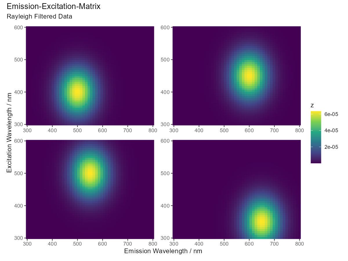
resulting in the following plot

Despite using plot_layout(axis_titles = "collect", guides = "collect") from the patchwork package, the axis are not shared for the combined plot.
Is there a way to ensure Only one shared X- and Y-axis title instead of repeated axis labels using the patchwork package? What should be changed in the example?
By using:
plot_combined <- (p1 + p2) / (p3 + p4) +
I believe you are explicitly defining rows and columns as independent so labels are being collected for each () object. It seems that having non-identical labels may also affect what gets"collect"ed.
You can simplify your workflow by creating a list of basic plots to supply to wrap_plots(), and then customising plot elements by piping any modifications using &.
In response to your comment regarding spacing, I have provided two options informed by Edward Tufte's canonical advice regarding the "data-ink ratio". The patchwork documentation discusses many other ways to control the plot layout.
library(ggplot2)
library(patchwork)

# Generate basic ggplot() objects as a list
plots <- lapply(list(df1, df2, df3, df4), function(df) {

  ggplot(df, aes(x, y, fill = z)) +
    geom_raster()

})
Now generate plot with expand = FALSE to reduce visual spacing, and add annotation, label, and colour elements:
wrap_plots(plots) +
  plot_layout(
    nrow = 2,
    ncol = 2,
    axis_titles = "collect",
    guides = "collect"
    ) +
  plot_annotation(
    title = "Emission-Excitation-Matrix",
    subtitle = "Rayleigh Filtered Data"
    ) &
  labs(
    x = "Emission Wavelength / nm",
    y = "Excitation Wavelength / nm"
    ) &
  scale_fill_viridis_c(limits = c(min_z, max_z)) &
  coord_cartesian(expand = FALSE)
An improvement, but IMHO also applying axes = "collect" creates a much less cluttered result:
wrap_plots(plots) +
  plot_layout(
    nrow = 2,
    ncol = 2,
    axis_titles = "collect",
    axes = "collect",
    guides = "collect"
    ) +
  plot_annotation(
    title = "Emission-Excitation-Matrix",
    subtitle = "Rayleigh Filtered Data"
    ) &
  labs(
    x = "Emission Wavelength / nm",
    y = "Excitation Wavelength / nm"
    ) &
  scale_fill_viridis_c(limits = c(min_z, max_z)) &
  coord_cartesian(expand = FALSE)

In this case, it will default to a 2x2 grid so nrow = 2 and ncol = 2 are not needed but I have included them for completeness.
- Simple question: how to add text to r chunk in rmd format?
- Issue with Label Behaviour in gganimate
- Combine census tracts with neighbor to reach a population threshold in R
- Creating a single map composed of three separate shapefiles
- Implementation of Cobb-Douglas Utility Function to calculate Receiver Operator Curve & AUC
- Overall percentages based on total count
- Pairwise dissimilarities nesting a time-series loop inside a site loop - multiple times
- Long/Lat points keep ending up in Kansas
- How to sum a column dependent on a value in another column
- Customize label for an Interaction Plot
- How to obtain RMSE out of lm result?
- Faceted mosaic plots with the same area scaling
- Unite columns with unique values
- How to print the current map while preserving data points
- How to solve error: mismatched lengths of ids and values when data has missing values in geom_line_interactive()?
- How do I transfer NAs from one dataframe to same position in a second dataframe
- Creating bar plots using ggplot, running into issues with data format
- Force initial zoom to truncate portion of the data
- R - select only factor columns of dataframe
- How to scale the units of the data & trend components of an autoplot of a multiplicative decomposition of a time series?
- Respect ratio when using ggarrange() and geom_sf()
- Changing size / aspect ratio of leaflet
- How do I use the lubridate package to calculate the number of months between two date vectors where one of the vectors has NA values?
- Adding to logos to flexdashboard
- R replace values of a column based on exact match of another data frame
- Error in grepl(pattern, df): invalid regular expression
- regular expression in R, reuse matched string in replacement
- Substract minimum value of row from each element of row in dataframe,
- R Reticulate does work with for loop but not purrr::map2
- Count all values in a correlation matrix that are above 0.8 and below -0.8